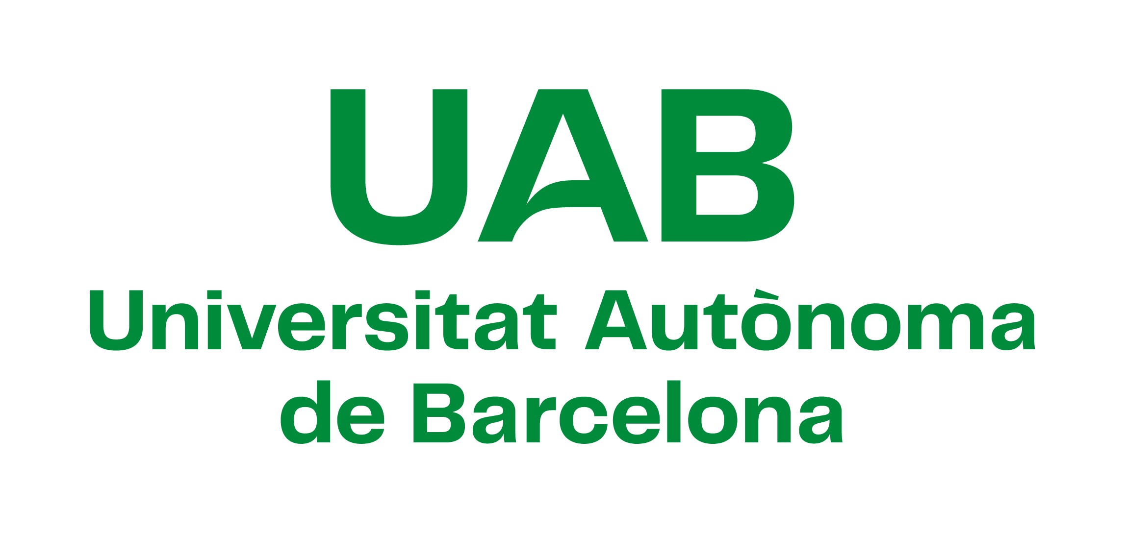
The UAB launches its new logo

The Universitat Autònoma de Barcelona presents its new logo in tune with the desire to modernise its corporate image, make its identity and values more visible, and at the same time make its UAB initials more legible.
13/06/2023
The new logo makes it easier to read the intials UAB and, therefore, reaffirms the University's commitment to accessibility.
The final design is a typographic logo in the green colour that represents the campus, in which specific focus has been put on highlighting the dynamism in the letter A, turning the horizontal bar into a curved line that evokes a blade of grassy and at the same time the page of an open book. This means that the bronze-coloured A will no longer be used, and the green colour of the campus becomes the new corporate colour of the UAB. Moreover, the Helvetica Neue typeface has been replaced by Telegraf, which gives the brand a younger look. The historic A engraved in bronze which has represented the University for more than 30 years will maintain its symbolic connotation and will be used in certain institutional spaces and special events.
The logo thus takes up the challenge of making the identity and values of the UAB visible and understandable around the world.
As well as updating the corporate image, the aim of this renovation was also to solve the difficulties of accessibility and readability of the previous logo, especially in a context of internationalisation of universities that forces the corporate identity to be readable both by students who already know the UAB and by students, especially international students, who are not yet familiar with it. The new logo also promotes a more accessible reading of the UAB’s initials and, therefore, reaffirms the University's commitment to accessibility.
A large range of applications
The new design facilitates integrating the logo in the names of the different centres under the UAB brand and combining it with those of other institutions. It is flexible in its application and very adaptable to different supports, colours, spaces, etc.
The first version of the Corporate Identity and Image Manual (Manual d’identitat i imatge corporativa) has already been published, which includes the logo and various applications, and which will be expanded over the coming months. The implementation in campus spaces and in all the University's communications will also be carried out progressively; for example, in this video presenting the UAB to future students.
This is the UAB's third logo since it was created in 1968. The first was a heraldic design based on the Barcelona skyline, created from a bas-relief by the sculptor Josep M. Subirachs, with the four stripes and the Saint George's cross. In 1988, the logo which, with successive variations, has represented the UAB up to the present day, was created with a design by the Morillas studio. The new logo was designed by the Mètode Design agency. In this other video you can see a historical review of the different logos that the UAB has had.
More information: https://www.uab.cat/ca/identitatcorporativa
